Manomet
Year
2015
Deliverables
Logo
Brand toolkit
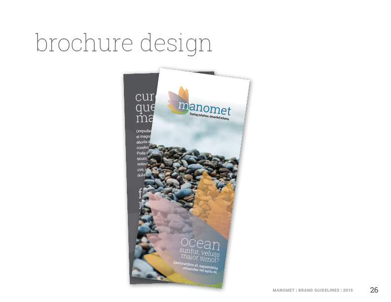
Print collateral
Powerpoint template
Brand toolkit
Print collateral
Powerpoint template
Rebrand.
Manomet is a nonprofit that champions better practices in conservation, business sustainability, and science education. Having previously focused primarily on bird research, it had outgrown its decades-old brand.
Logo
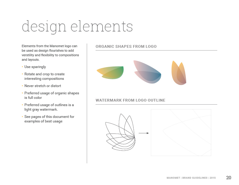
The Manomet logo conveys organic growth and direction, and reflects the many-layered approach that Manomet takes in its work. It also contains elements of flight, relating back to Manomet’s expertise in bird research and protection. The shape and colors are intentionally combined to relate to many aspects of life: the logo could be seen as representing wings, a flame or a movement, for instance. The shapes and forms are optimistic and hopeful, clean and professional. By using multiple layers of these organic shapes, we convey the idea that the sum is greater than its parts.
Brand Toolkit


”I am as proud of this project as anything I’ve ever worked on.”
Manomet's president